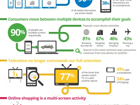
Unless you’ve been living under a rock with no Internet
access, you’re probably well aware of the prevalence of
mobile devices like iPads, iPhones, and Androids. In addition
to the increased use of mobile devices, there’s also the change in behavior.
More and more people are engaging
across multiple access points.
Facebook revealed 600 million users now access Facebook from a mobile
device. Furthermore, a significant portion of these mobile users don’t view the
social network from both mobile and desktop. Many view it just from the
desktop, but there is also a growing number that only view it from mobile (102
million users, or 10.68 %). Back in
July, when Facebook revealed the 543 million mobile and the 955 million total
numbers, mobile consisted of 56.86 percent of the company’s total members. That
number has been steadily growing with each update.
So, if you’re still reading this then I’m sure you feel the
pressure to go mobile. The first thing you should do is open up Google Analytics and look at the “Devices” report under “Mobile”. This will show you which
mobile devices people are using to access your site. Take a look at how your
website renders on these devices and decide if you need to make any changes. You
want a website that users won’t need to pinch, tap, or squint in order to view.
Three Steps to Developing a Mobile Presence
1. Have A
Clear Objective
Understand the how users will engage with your
site on mobile, beyond readability.
Ask yourself if a mobile user would have different needs
than someone accessing your site through a browser.
Think about proximity, location and ease-of-use. For
example, a person attending your site for charity walk might want to have to
have start times, or GPS layout for the course. Attendees to your annual
meeting want to access their itinerary for workshops and sessions with alerts
and locations as they are about to start.
2. Choose Your
Mobile Option
Create a Mobile Site
– Creating a mobile site means creating a completely separate website for
mobile devices. The great thing about creating a separate mobile site is the
user experience. Because the site is designed for specific dimensions, the
content will be easy to view and interact with. The downside is the expense and
work.
However, if you use Contensive, you can utilize mobile
templates and a module called MobileView , to automatically render a mobile
site, and allows you to select which pages to display on mobile devices and
which pages to hide and you won’t have to duplicate content creation efforts.
Create a Mobile App
– A mobile app that contains your website content can create even a better user
experience then a mobile site. Users can access your content off-line,
integrate location features, and receive push notifications for any updates. The
downside of a mobile app is the cost and maintenance.
Create a Flexible Width Website – This is the easiest and cheapest approach to creating a
responsive website. This website uses the flexible with approach, meaning that
it automatically resizes itself in response to the device. The downside is you get
what you pay for and more often than even with fluid sizing the content isn’t going
to work or look right.
 3. Test, Test,
Test
You certainly want to test your mobile site before launch,
but you also want to test after. The reason why is that you have very little
information for how people will actually use your
mobile website. Testing your mobile sites after they go live will help you improve it much faster.